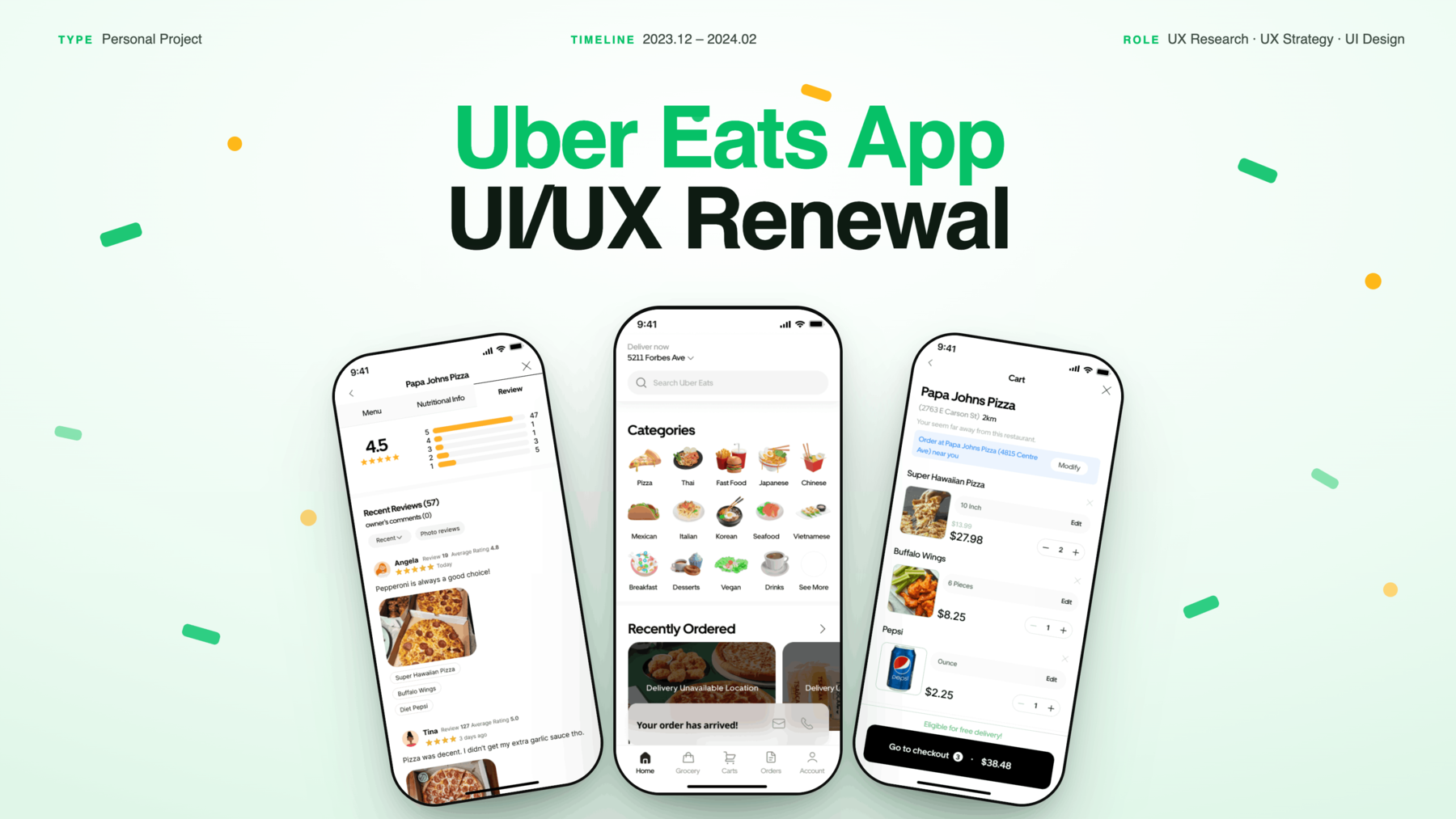
A UI/UX redesign of the Uber Eats app — targeting the communication breakdowns, navigation friction, and checkout confusion that left 54.5% of users at neutral satisfaction.
A survey of 10 Uber Eats users revealed mediocre satisfaction — not because delivery was broken, but because friction at every surrounding step made the experience feel unreliable.
Surveys and interviews made the pattern clear — frustration wasn't scattered. Every friction point users described led back to the same core problem: delivery mishaps, with no way to prevent them and no path to resolve them.
Users experience discomfort from delivery mishaps caused by poor communication and complex usability — and need better alternatives when things go wrong.
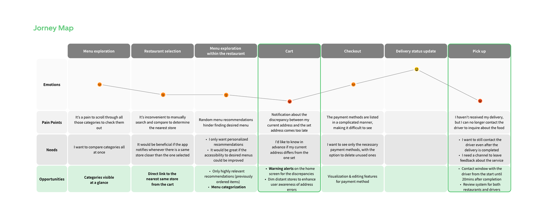
Digging into the causes revealed a clear pattern: the app was built around completing orders, not around what happens when something goes wrong. Three precise UX failures defined exactly where the design had to step in.
Mapping Angela's journey from menu browsing to pickup revealed exactly where each gap surfaced and what she needed in that moment.
"I want to order food quickly and get it delivered safely!"
Rather than a full redesign, each strategy closes exactly one structural gap — working within Uber Eats' existing design system.
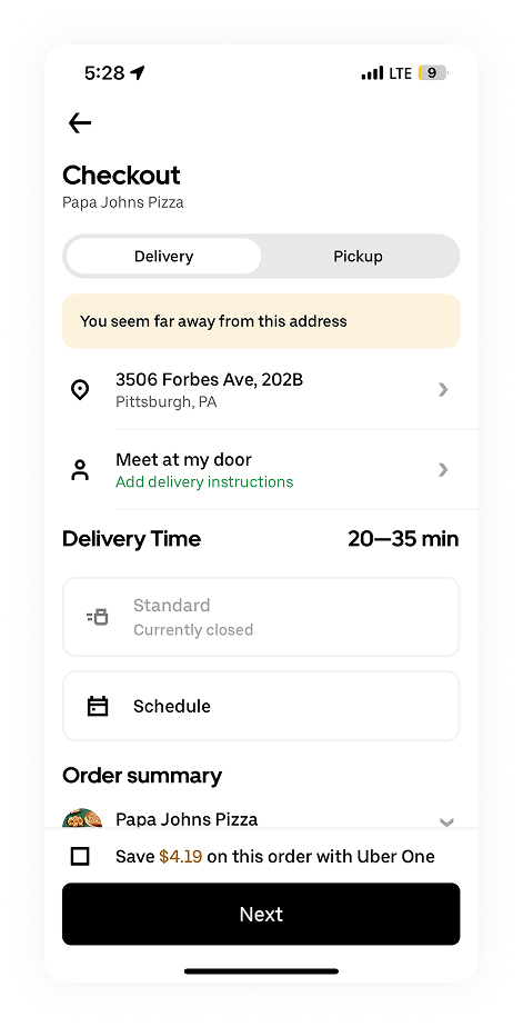
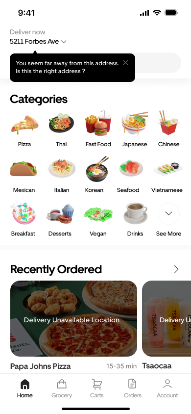
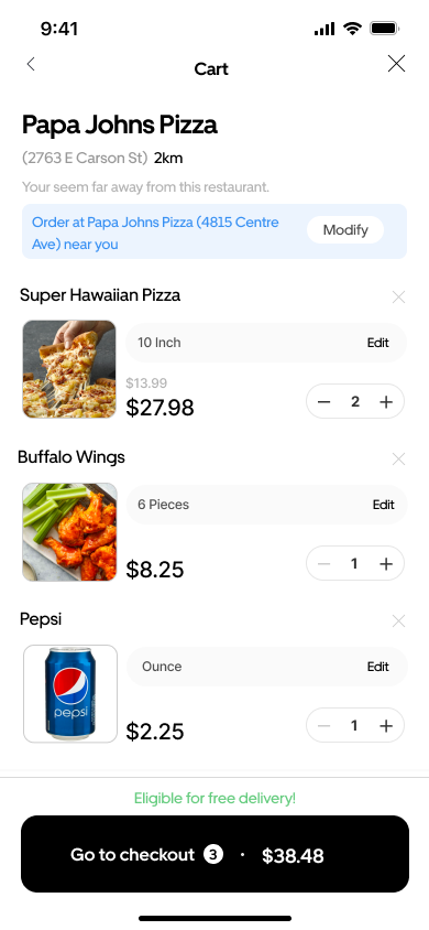
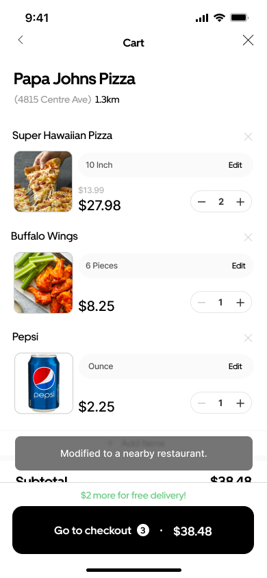
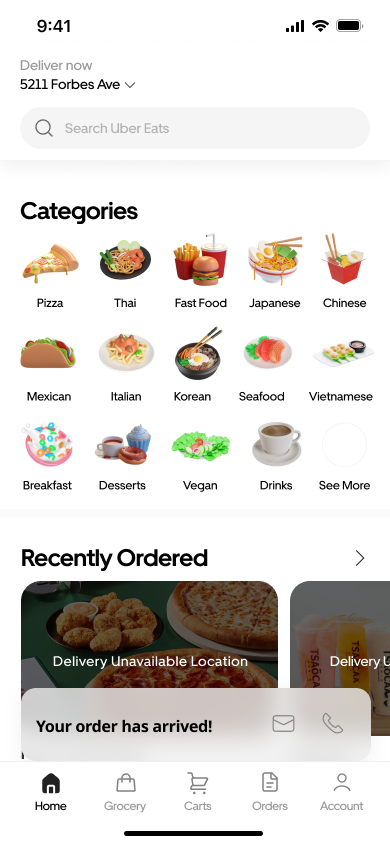
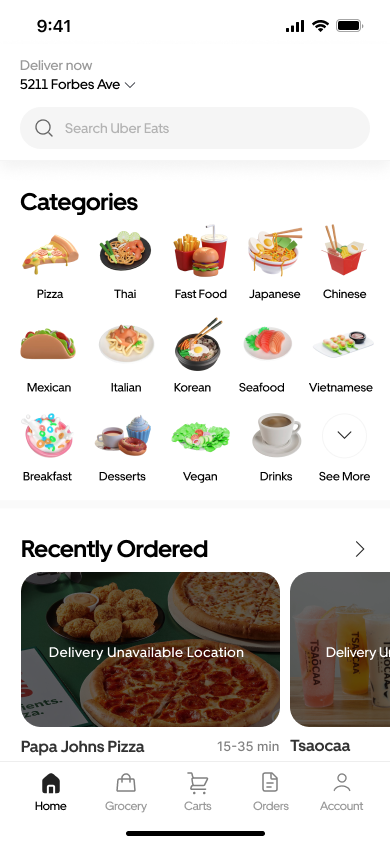
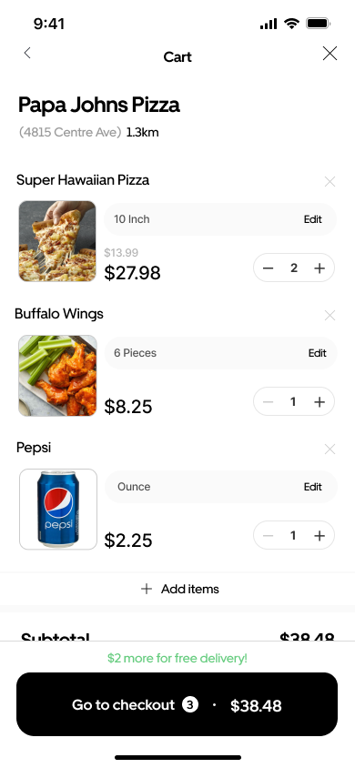
A home screen alert now catches address mismatches before browsing starts. If the user still reaches the cart with a farther store selected, a one-tap branch switch carries items over automatically.

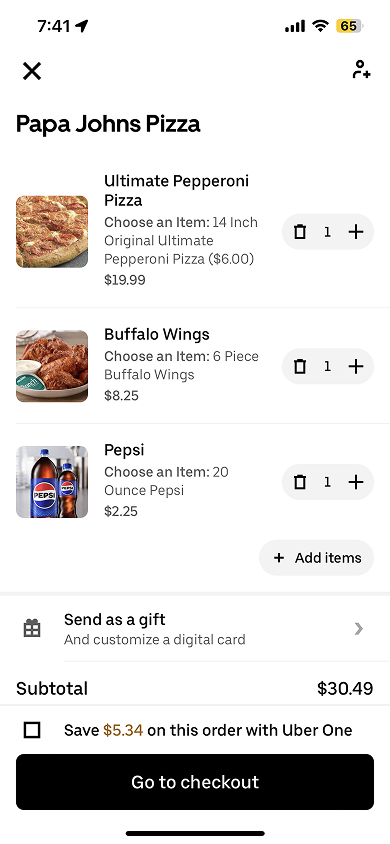
Warning fires at checkout — cart already built

Alert before browsing · out-of-range stores dimmed


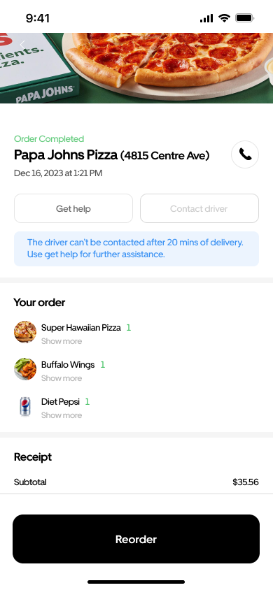
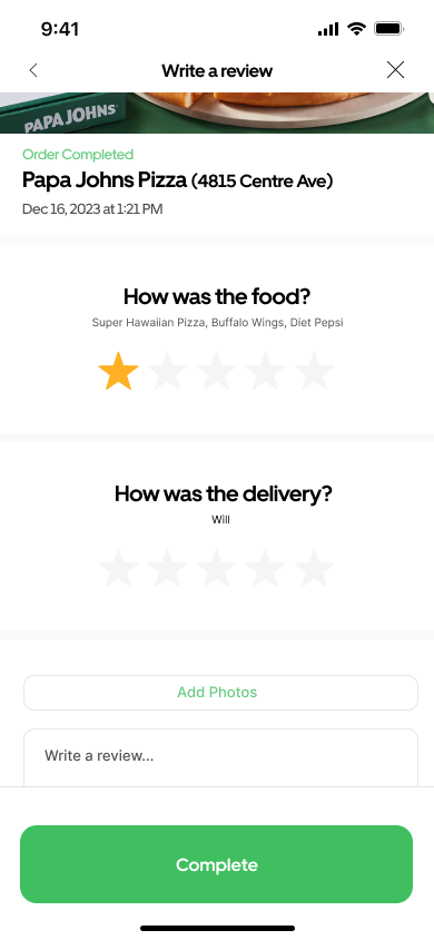
Once delivery is marked complete, all contact options disappear. A 20-minute driver chat window and a 3-day restaurant review channel give users a direct way to follow up.


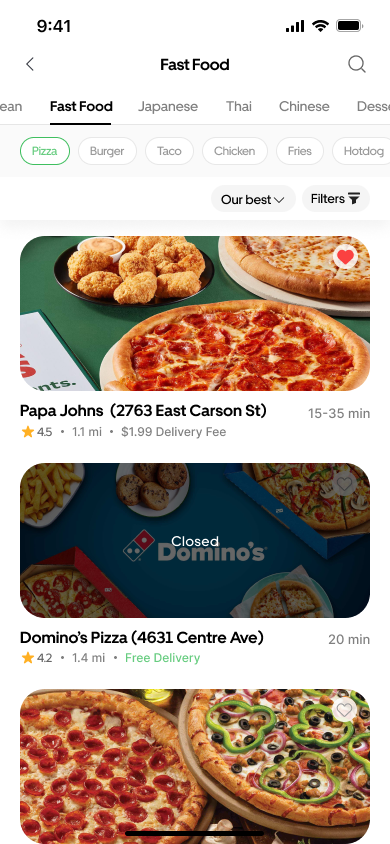
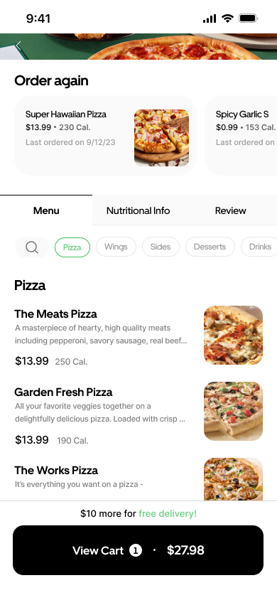
Instead of algorithm-picked recommendations, food is now organized into hierarchical categories for faster, intent-driven browsing. In the cart, three previously conflated actions are now separated into distinct, labeled controls.

Home · category grid

Home · subcategory view

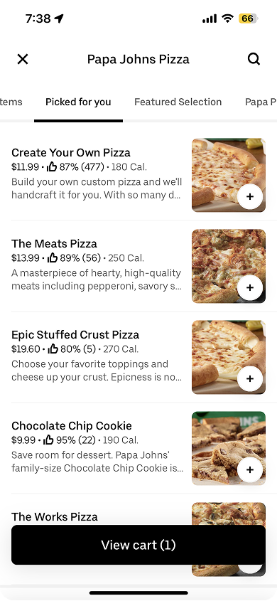
Recommendation tabs bury the actual menu

Content tabs · subcategory chips · menu no longer buried


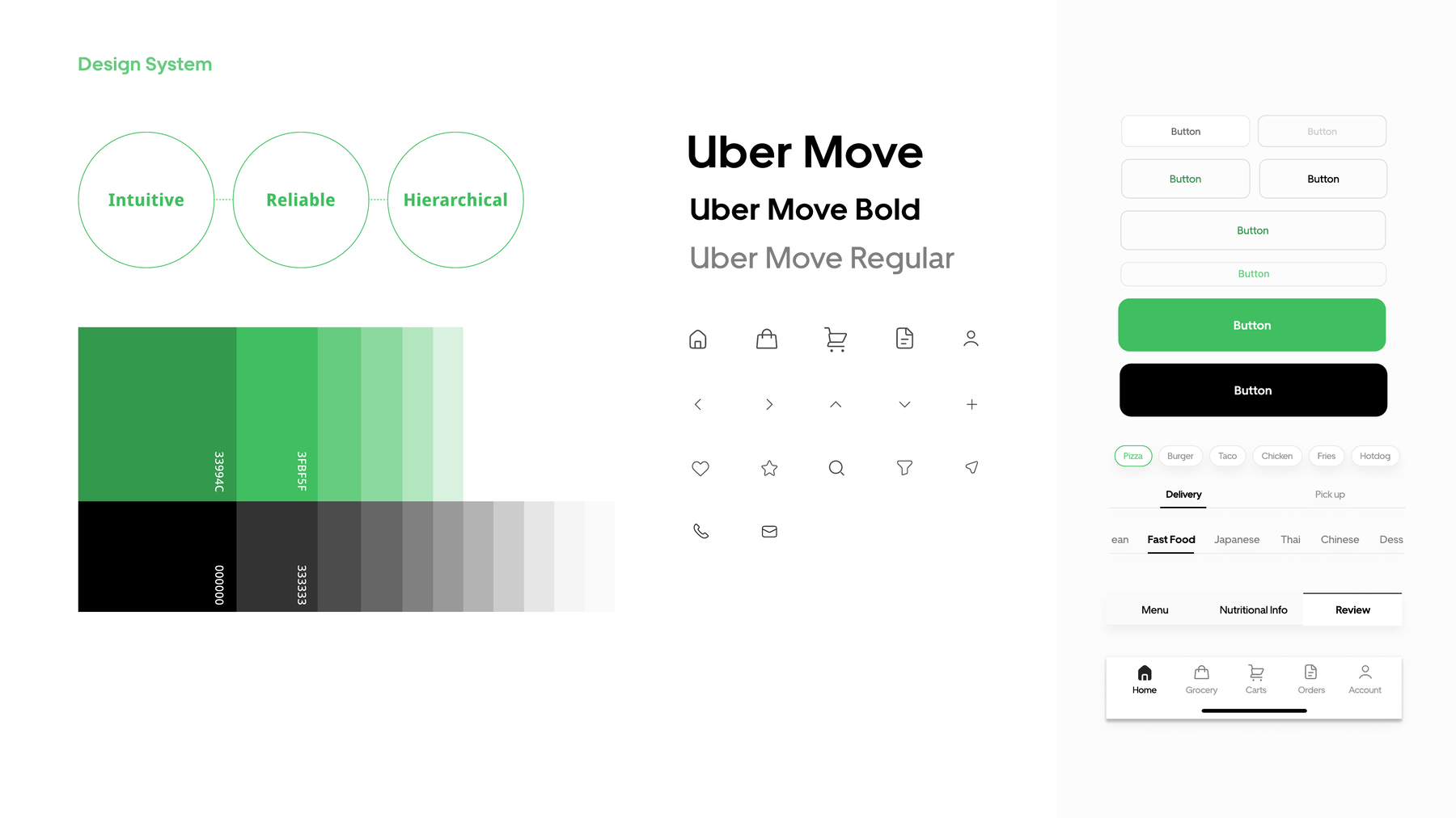
Every screen stays within Uber Eats' existing system — Uber Move typeface, green primary palette — so the solutions feel native. Three principles guide the work: intuitive, reliable, hierarchical.
This project was about identifying exactly what needed to change and making those changes fit naturally within an existing system.
Delivery mishaps were the surface problem users described. Digging into the causes revealed three distinct gaps across prevention, recovery, and navigation, each requiring its own targeted solution.
Every solution had to integrate into existing screens without disrupting the overall flow. The address alert, the post-delivery chat window, and the category grid all had to feel like they always belonged in the app, not like additions layered on top.