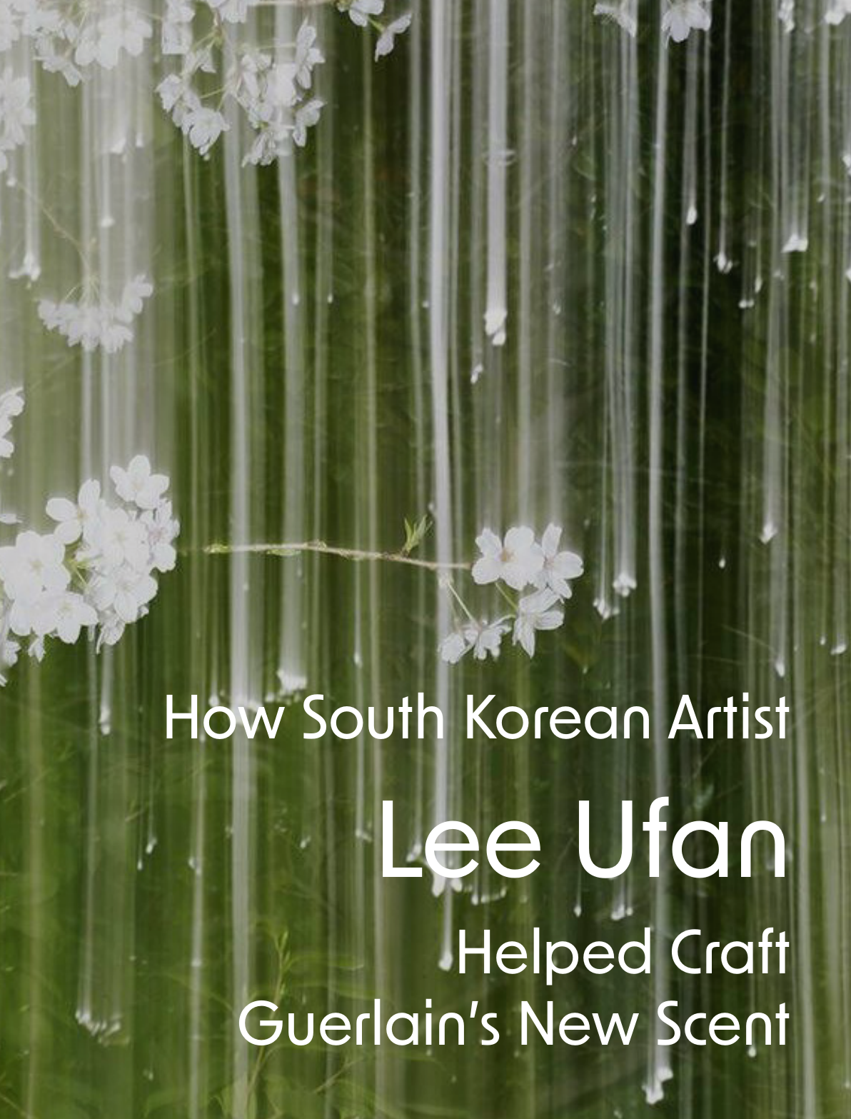
A five-page editorial feature built around Souvenir d'Orchidée — the Guerlain fragrance the Korean artist Lee Ufan composed from memories of mountain rivers and blue orchids. The design gives shape to something intangible: scent and memory.
I chose an article on Lee Ufan's collaboration with Guerlain and reimagined it as a long-form magazine feature — a cover leaf and two double-page spreads. The aim was to let a reader grasp the essence of the scent at a glance, through typography, pacing, and a single consistent green pulled straight from Lee Ufan's brushstroke on the bottle.
Scent is invisible, so the design leans on evocative imagery and generous white space to carry a mood rather than describe a product — mountain rivers, blossoms, and water reading across the gutter of each spread.
Brand Direction
Exploring two brand directions.
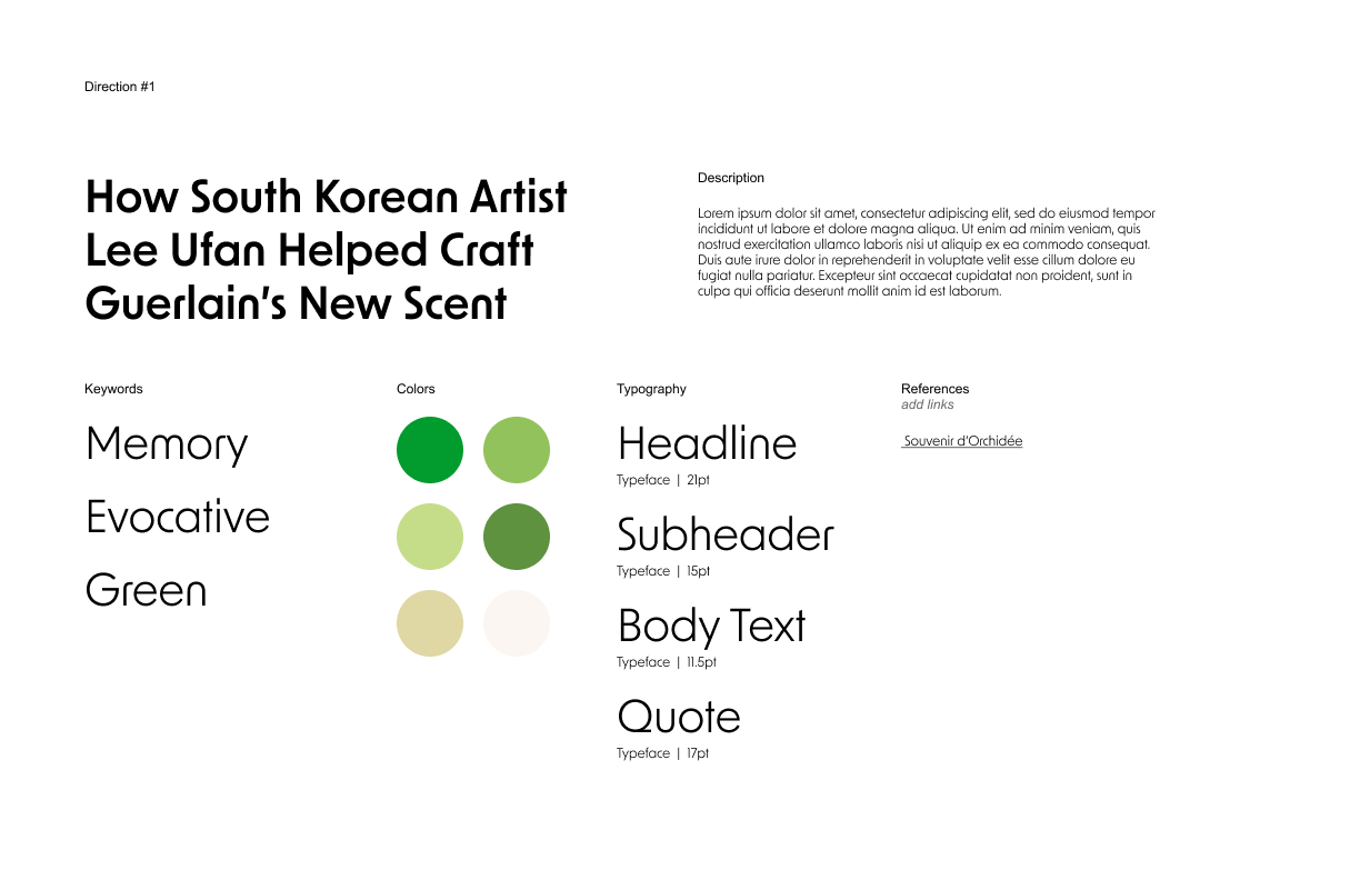
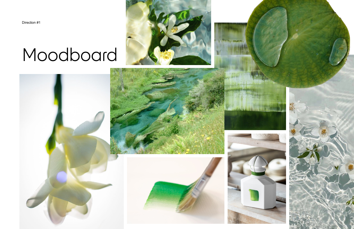
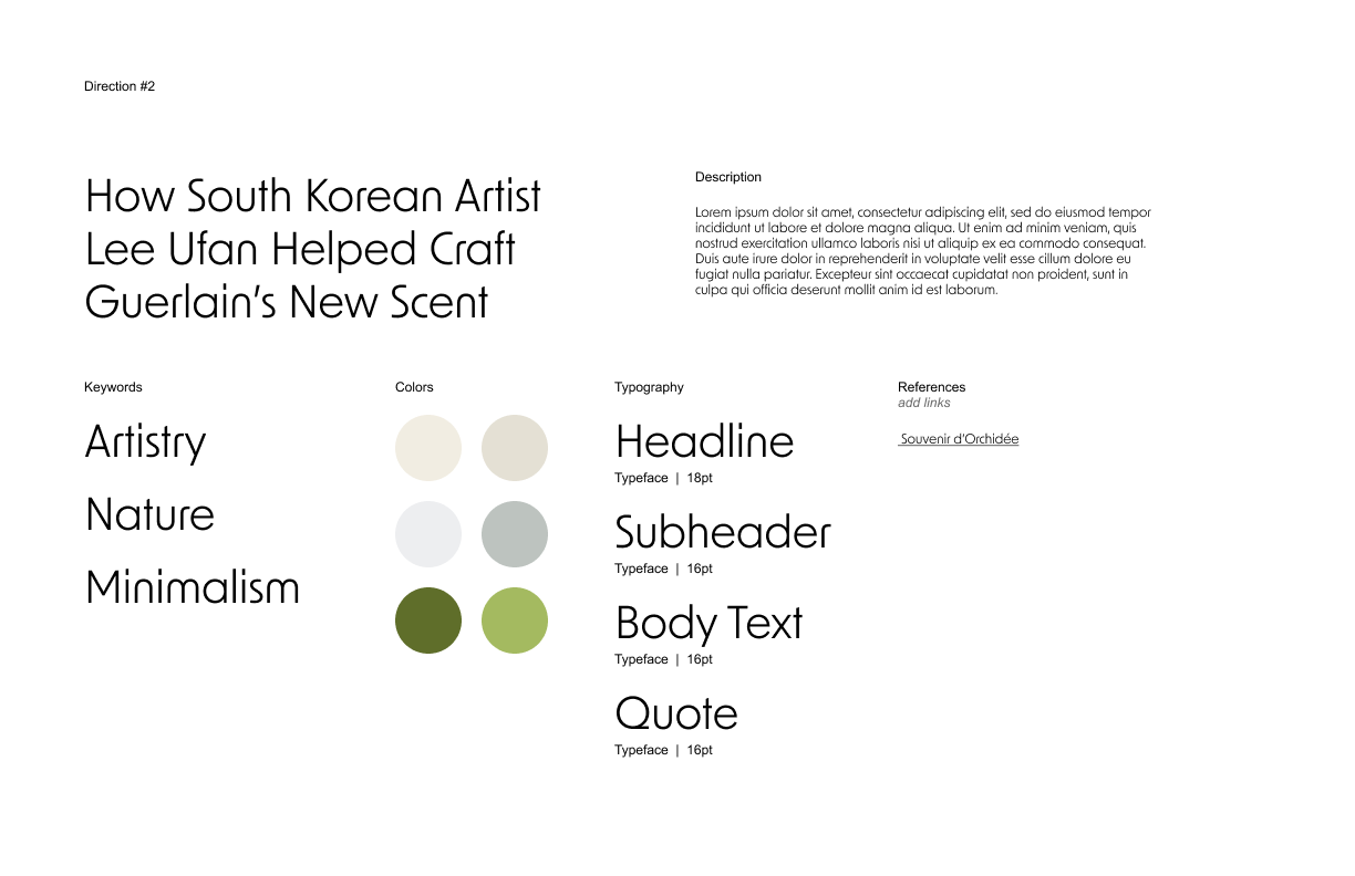
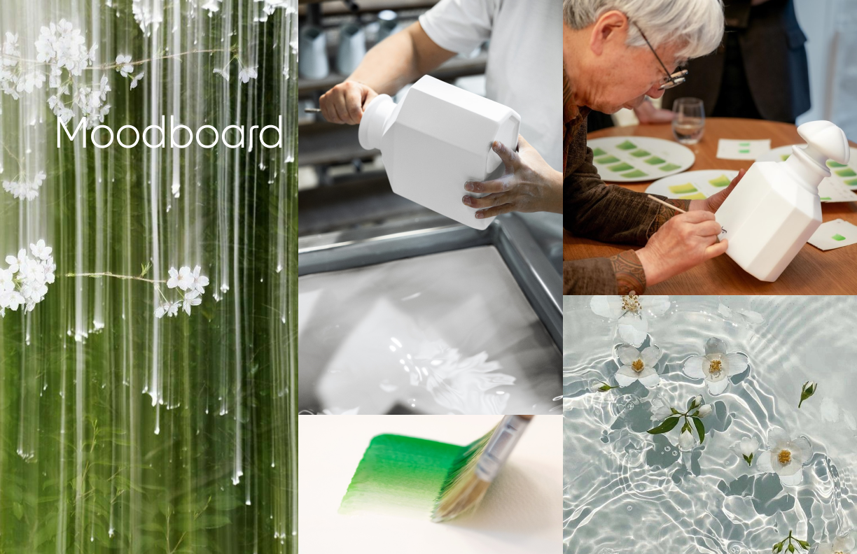
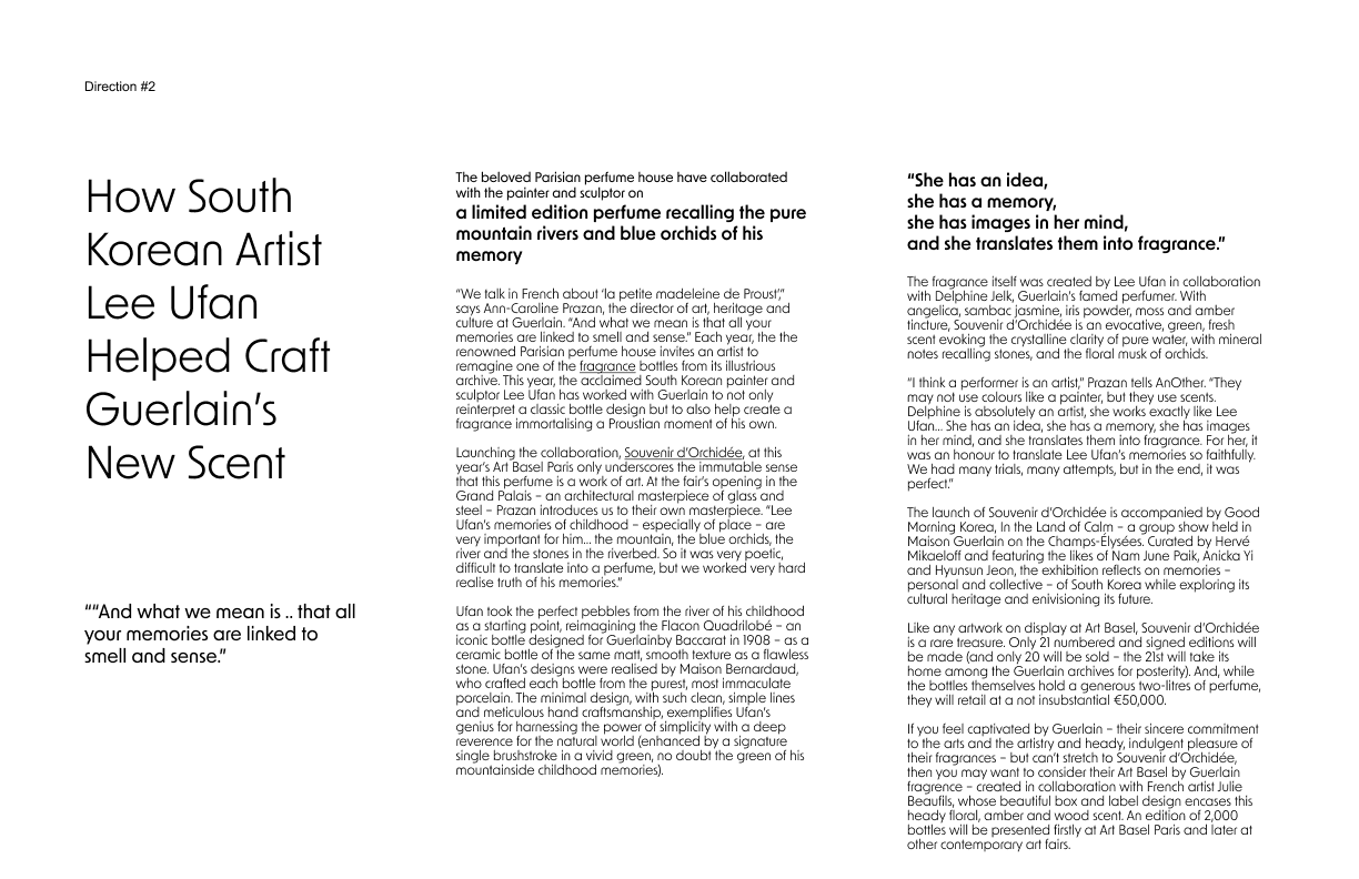
Before laying out a single page, I built two brand templates — each with its own keywords, palette, typography, and moodboard. Direction 1 chased the abstract, psychological pull of scent; Direction 2 stayed literal and minimal, centered on the craft of the bottle. I carried Direction 1 forward for its evocative green world.
Direction 01 — Memory · Evocative · Green
Selected
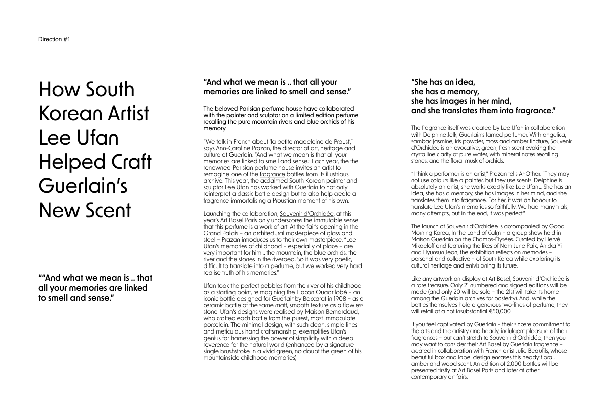
Direction 01 leaned into the abstract, psychological pull of scent — a saturated green world of mountain rivers and blossoms, with the article's quote pulled up as a subheading. This is the direction I carried into the final spreads.
Direction 02 — Artistry · Nature · Minimalism
Direction 02 stayed literal and restrained — neutral tones, the craft of the bottle, and a pared-back minimalism. A strong alternative, but less evocative of the memory the scent was built on.
Type & Colour
Minimal type and an evocative green.
I set all the type in New Order, a geometric sans-serif whose clean, even strokes suit Lee Ufan's minimalism and stay legible across heavy text. Shades of green run through the pages to tie them together, and the first line of the article becomes a subheading, building a hierarchy the original prose didn't have.
MemoryEvocativeGreenMinimalismNature
The Spreads
Two spreads, one continuous green.
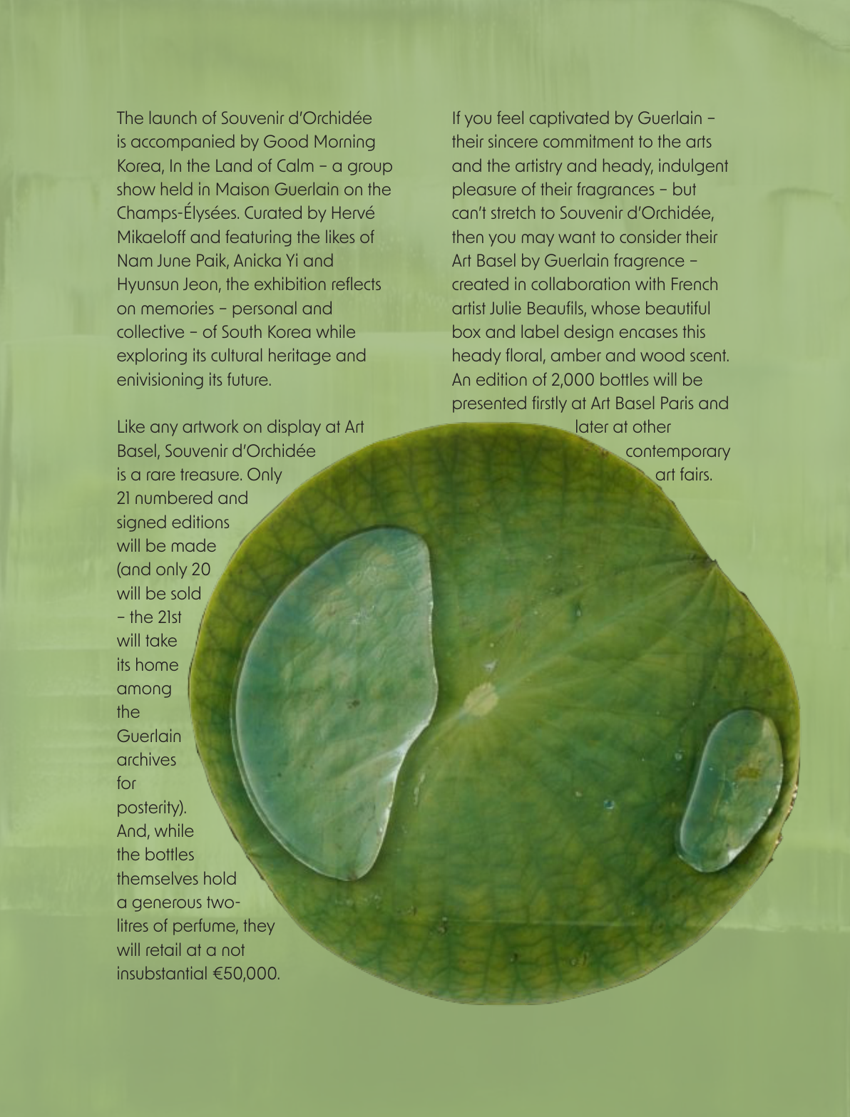
Each double-page spread groups the story into a clear visual hierarchy — an oversized quote as an entry point, and imagery that carries the mountain-river memory from one page to the next.
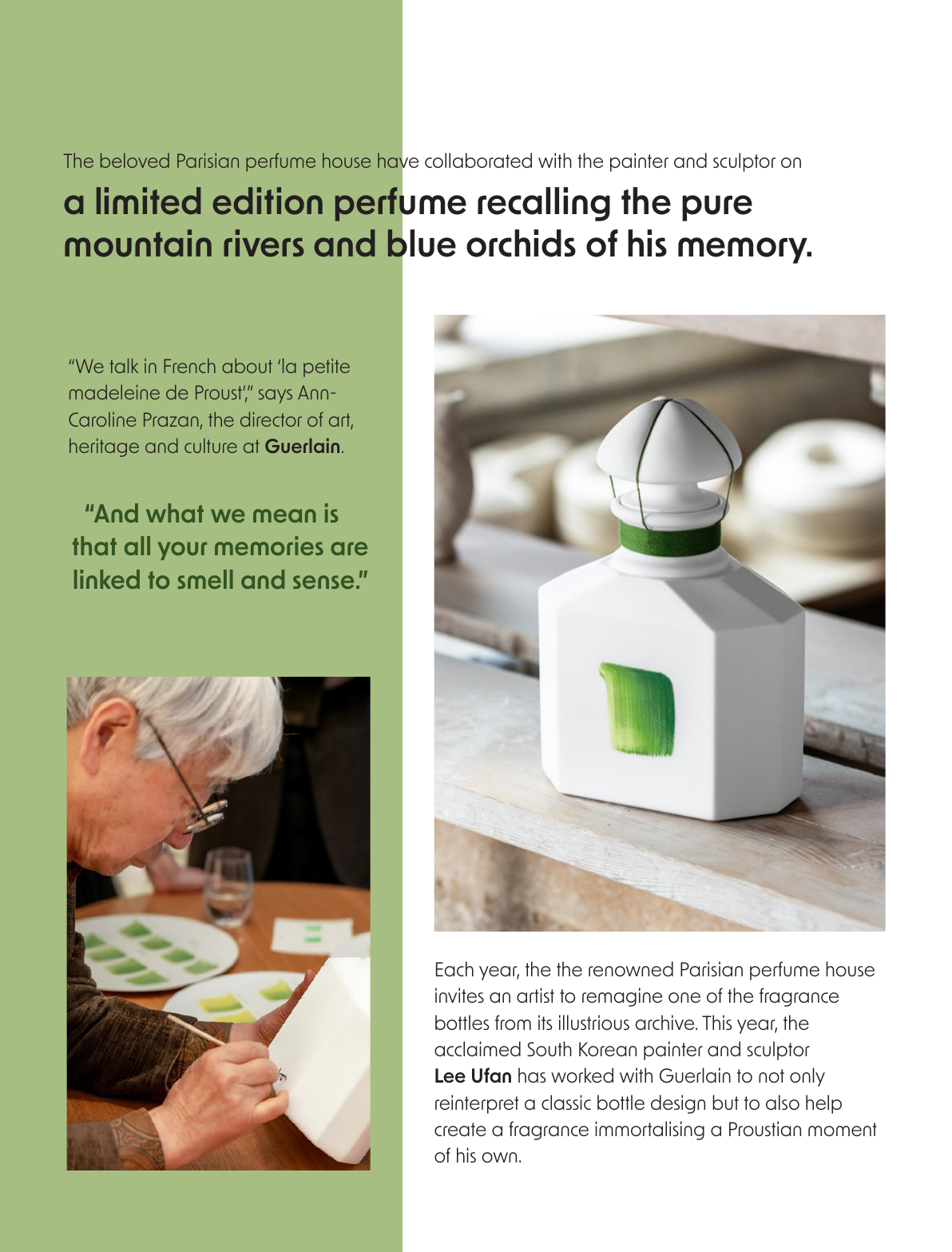
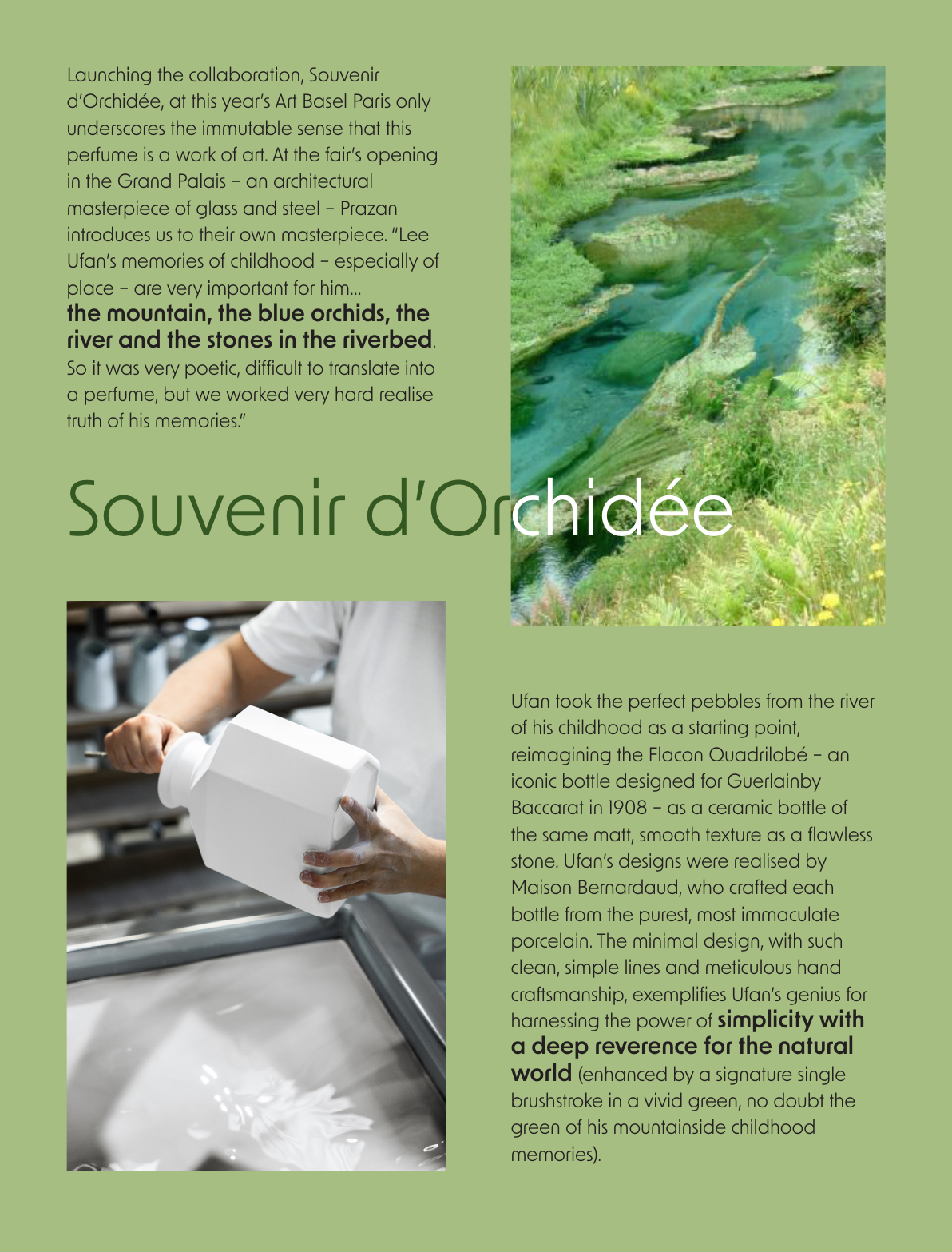
Spread One. The collaboration and the object — Lee Ufan's brushstroke and the Flacon Quadrilobé reimagined in porcelain.
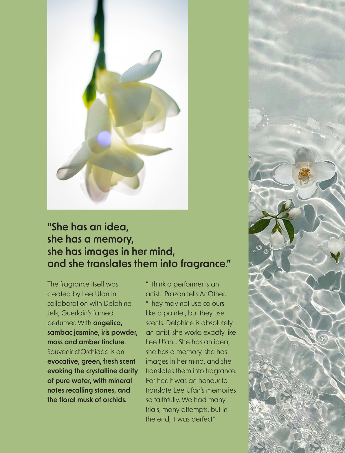
Spread Two. The fragrance itself — orchid, water, and text set to wrap the imagery as the feature closes.
Digital
Rebuilt for the scroll.
Digitizing the feature meant rethinking pace for vertical reading — enlarging the lead image, folding the highlighted quote back into the paragraph so it wouldn't interrupt the flow, and carrying a continuous textured green background down the page.
The digitised feature. Scroll within the frame to move through the full page.