Meet through moments,
not just matches.

A group activity-based Bumble experience that helps users move from digital matching to safer, more natural in-person connection.

ROLEUI/UX Design · Interaction Design · Prototyping TeamSolo · Class Project TimelineJan – Mar 2025 ToolsFigma
Bumble IRL Cover
The Problem

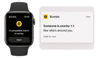
"Someone is nearby"
was not enough reason to meet.

I was given a brief to explore how precision location could drive premium growth — but research revealed the real barrier wasn't visibility. It was motivation, safety, and social comfort.

Original Brief

Use precise location to notify users when a compatible match was physically nearby across mobile, desktop, and Apple Watch (within 0.5 km).

Business Goals
Encourage premium upgrades
Increase location opt-in
Deliver cross-platform proximity notifications
Drive real-time engagement
Underlying Assumption

"If users knew a match was nearby, they would be more likely to engage — and ultimately convert to premium."

What I Found Problematic

01
Proximity alone didn't sustain engagement

Usage declined after initial curiosity. Awareness didn't translate into action.

02
Notifications were passive, not actionable

Users had no clear reason to act. "Why now? Is this the right moment?"

03
Precise location increased emotional friction

Real-time visibility felt vulnerable in dating contexts.

"The bigger issue was not distance. It was motivation, safety, and social comfort."

Key Insight

Shared context created stronger engagement
than physical distance alone.

Nearby match alerts created awareness, but not enough motivation to act.

Proximity Alert
12.27% 8.29%
Engagement decline over 6 months
Map Integration
25.17% 16.27%
Engagement decline over 6 months
01
Proximity-based engagement declined over time

Initial curiosity did not translate into sustained interaction. Awareness of a nearby match did not drive repeated behavior.

02
Context-driven interaction performed better

Map integration consistently outperformed proximity alerts across CTR, interaction rate, conversion, and retention. Users responded more positively when interaction was tied to contextual information.

03
Emotional comfort influenced willingness to meet

Secondary research on location-sharing behavior suggested users were more hesitant when interaction felt overly exposed or lacking social context.

Barkhuus et al., 2015 · Forbes Health, 2024
Solution

I shifted Bumble from proximity alerts
to shared activity-based moments.

From
Proximity Alerts

"Someone is nearby"

To
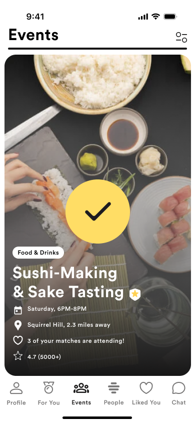
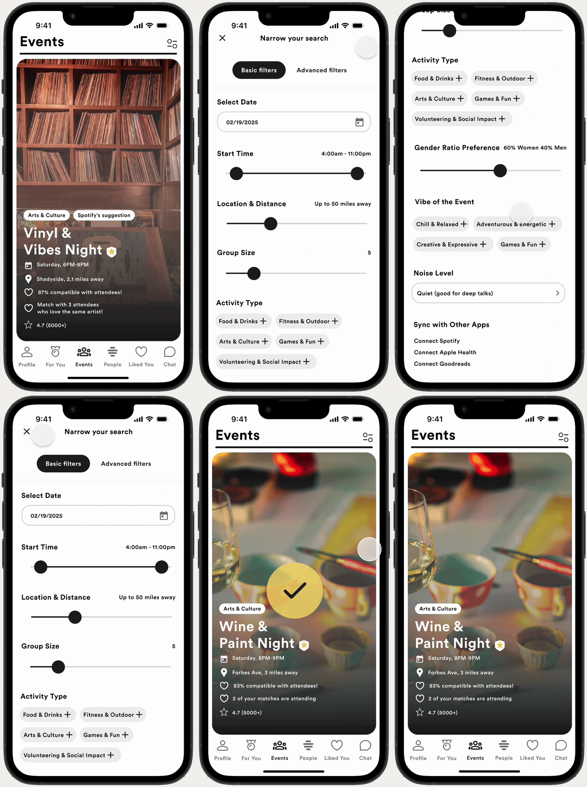
Shared activity-based moments — events screen

"Here's a shared reason to connect"

Shared Public Events
Contextual Interaction
Lower-pressure meetup flow
Reframed Problem
From
"How can we get users to meet faster?"
To
"How can we lower the pressure of meeting by
giving users a shared reason to connect?"
Design Decisions

Reducing emotional friction
became the core design principle.

Insight

Users spend significant time in low-value messaging before determining compatibility.

Design Response

Shared activity cards help users assess compatibility through real-world context instead of prolonged conversation.

Insight

Real-time location visibility increased feelings of vulnerability.

Design Response

Structured public events and visibility controls create a safer and more comfortable meetup environment.

Insight

Users engaged more when interaction occurred within shared context rather than passive proximity.

Design Response

Mutual event participation creates a more intentional and natural path toward meeting.

New Experience Flow

Meeting became a gradual shared experience — not a high-pressure decision.

01
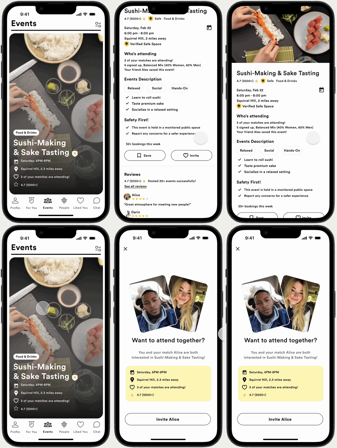
Browse Events
Discover events based on your interests, location, and vibe.
02
View Event Context
See event details and which of your matches are interested.
03
Express Interest
Show interest or RSVP directly.
04
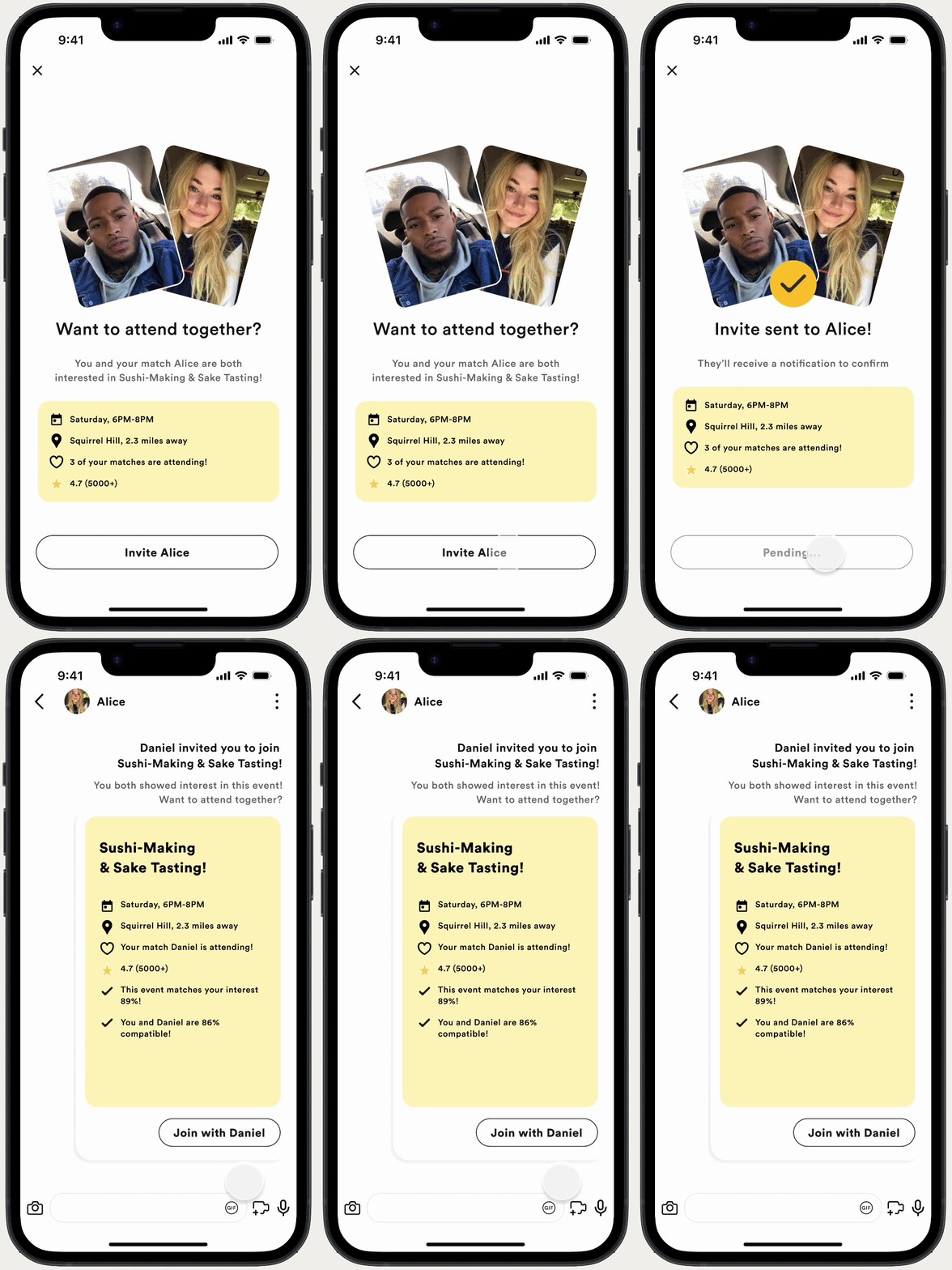
Mutual Invite Prompt
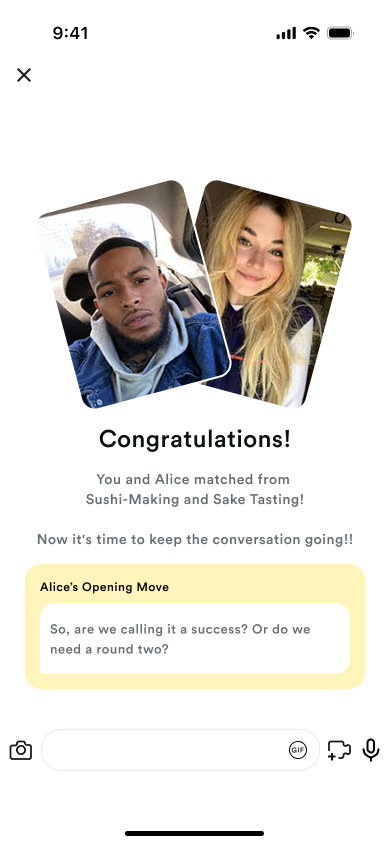
When both you and your match are interested, Bumble prompts an invite.
05
Attend Together
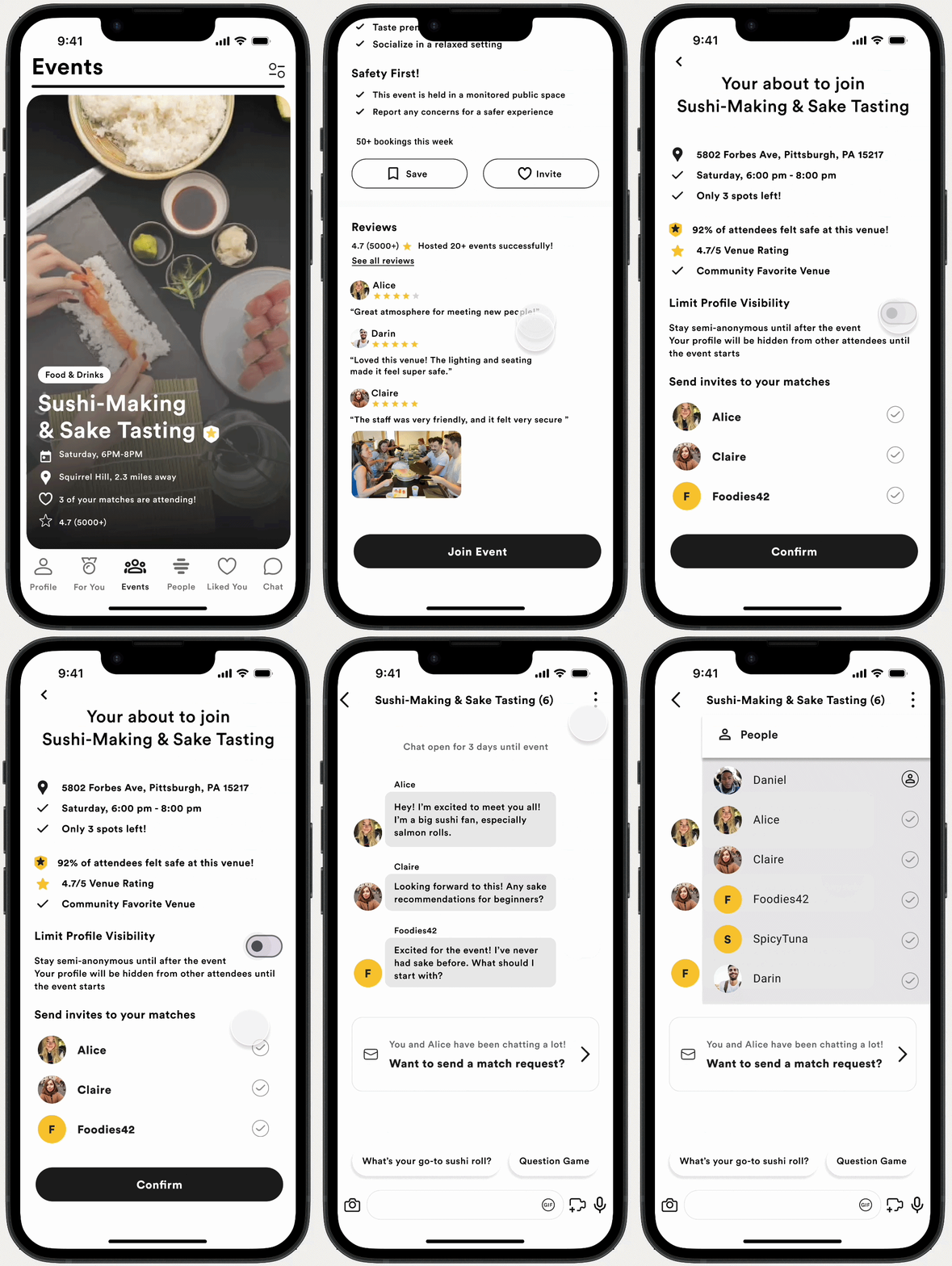
Enjoy the event in a safe, shared environment.
06
Post-Event Reconnect
Privately choose who you want to reconnect with.

Every step reduces pressure and builds comfort, making meeting feel natural and intentional.

Features
Activity Cards UI
Feature 01

Activity cards made meeting feel more approachable.

Familiar Swipe Interaction
Leverages an existing, intuitive pattern to reduce learning curve
Lower-pressure meetup flow
Focus shifts from profiles to shared experience
Contextual activity discovery
Quickly assess activity, location, time, and attendees
Reduced planning friction
Gives users a natural reason to engage
"Activity cards helped users imagine the meetup before making a move."
Semi-Anonymous Mode UI
Feature 02

Semi-anonymous mode gave users more control before meeting.

Reduced perceived vulnerability
Users share what they're comfortable with
Increased emotional comfort
Helps users feel safer in early interactions
More control before engagement
Control builds confidence and encourages participation
Mutual Invite UI
Feature 03

Mutual invites reduced the awkwardness of initiating.

Contextual prompting
The invite is tied to a specific activity, so users have a clear reason to meet.
Shared interest trigger
Bumble suggests the invite only when both matches are interested in the same event.
Reduced initial pressure
The system creates the opening, so one person doesn't have to force the first step.
"Shared interest made the invite feel like a natural next step."
Premium Feature

AI-powered recommendations
created a clearer premium value.

Premium users receive AI-curated event recommendations based on their interests, past event behavior, attendee compatibility, and optional external signals like Spotify or Goodreads. Instead of showing nearby events only, Bumble IRL helps users understand why an event is personally and socially relevant before they commit.

Personal relevance
AI recommends events based on your interests, preference filters, and past event history
Social compatibility
See compatibility with attendees, including a visible % match score
Premium signals
Optional integrations like Spotify, Goodreads for richer recommendations
Business Value
Smarter recommendations make premium feel more useful, driving upgrades and engagement
AI Recommendations UI
Design System

I extended Bumble's visual language
for event-based interaction.

I built a component system for activity cards, invite prompts, safety indicators, visibility controls, and post-event connection states — balancing Bumble's playful identity with clarity, trust, and user control.
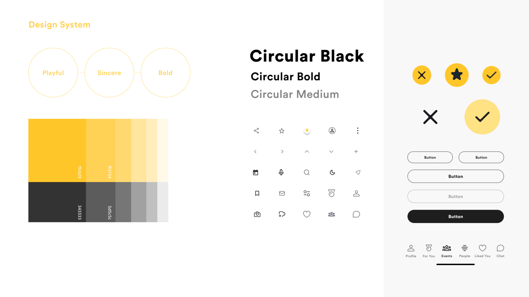
Design System Components
Final Experience

Shared experience became
the foundation for connection.

After participating in an event, users privately select who they want to reconnect with through a 'Tap to Connect' interaction. Only mutual interest opens a private conversation, shifting the foundation of matching from profile-first attraction to shared real-world experience.
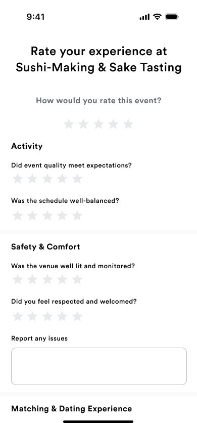
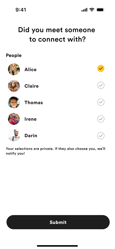
01 Attend the event
Attend the event
02 Review your experience
Review your experience
03 Select who to reconnect with
Select who to reconnect with
04 It's a mutual match
It's a mutual match

"The experience remains valuable even without a romantic match.
You still enjoy the event, make memories, and leave with meaningful social value."

Reflection

Good design starts
by questioning the brief.

The original direction focused on making nearby matches more visible through precision location. But through research, I found that visibility alone did not create meaningful interaction.
The deeper problem was emotional hesitation: users needed safety, context, and a more natural reason to meet. Reframing the brief around that hesitation, instead of solving it as written, shaped every design decision that followed.

01
Question assumptions

The most impactful solutions often start by challenging the original problem framing

02
Let research lead

Behavioral data and user insights revealed the real barriers to connection

03
Design for human need

Emotional comfort, safety, and context drive real-world interaction
Back to Work